Thursday, July 9, 2009
Tuesday, July 7, 2009
Use of Google Chart API In Xcelsius
In Xcelsius we dont have any 3d charts.. But we can get it by using google chart API.
In this post i'm going to explain how to use googl chart API in Xcelsius..
you can findout GOOGLE Chart API here
By passing URL parameters from your Xcelsius Model(Concatenate the cells)
http://chart.apis.google.com/chart?cht=p3&chd=t:60,40&chs=250x100&chl=Hello|World
the below SWF file shows the Google Chart api in Xcelsius
I will Upload Source file soon...
Export2Excel in Xcelsius
If you are using IIS Webserver please CLICK HERE.
If you are using Tomcat webserver CLICK HERE
Hope this is very usefull stuff..
Thanks to BI GURU and Luca Spinelli & Ivan Aguilar(ClearPeaks) for providing this.
We have another type of functionality Xport wizard that provided by Centigon Solutions .
but xport wizard is bit expensive compare with above two..
Simulate Excel conditional formatting in Xcelsius 2008
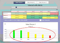
I used the rectangle component to simulate this functionality. Try the interactive model below and read the steps. I would recommend you to Download the Source Files at the end of this post and go through the steps while looking at the XLF model.
Steps to get it;
1 Create a sample sales data excel file.
2 Drag the Spreadsheet table component into the canvas and bind it to the resulted salespersons region values. After bind it to the display data we need to select the ROW and bind the source data and destination to the excel sheet.
3 A chart component placed on Canvas and the series is need to map the spreadsheet table component destination. Then go to alerts tab and just check enable to alerts option and go to Color order check the high values are good.

4 Checking the values by using the formula
=IF(G23<30,1,if(and(g23>30,G23<70),2,if(g23>70,3,""))).
The above formula is checking the values are <30 color="#ff0000">Red color, sales>30 and<70 color="#ffff00">Yellow> color and sales>70 it displays the Green Color. This will check the every cell in the lookup values.The resulted values are as follows.

5.Then take three Rectangles (Red, Yellow and Green) and set the display status to 1-> red, 2->yellow and 3-> Green. That rectangles are placed before the table component(be careful while giving the Dynamic Visibility to rectangles).
6.The slider component is added for the interactive with the alerts.

7.The above image shows the interactive with the table and Chart(Alerts)
Multiple Series Insert in (Xcelsius)
The below example shows the how to simulate multiple series drill down in Xcelsius
How to do it
Take a column chart and map the yearly data by using the “by range (data in rows)”.
Then you need to click on “by series” the chart will shows the yearly data.
Step 2:
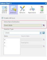
Go to “DRILL DOWN” tab and check the “Enable Drill Down” check box…
Here you need to do carefully
A) Here we have to bind “Series Name Destination” to Sheet1! $G$1 cell(in fig1), It throws the Series name ‘a’,’b’,’c’.

B) then the next step is Insertion type select insertion type as column. Click on Series “A and bind the source data with the Years(2007,2008,2009) and we need to do same for the B and C Series also. But we have to bind the destination of each series with different cells
Then come to Excel spreadsheet concatenate series names, we use this concatenated key as a search key for the monthly data (Fig2)

